Dippin’ Dots Rebrand
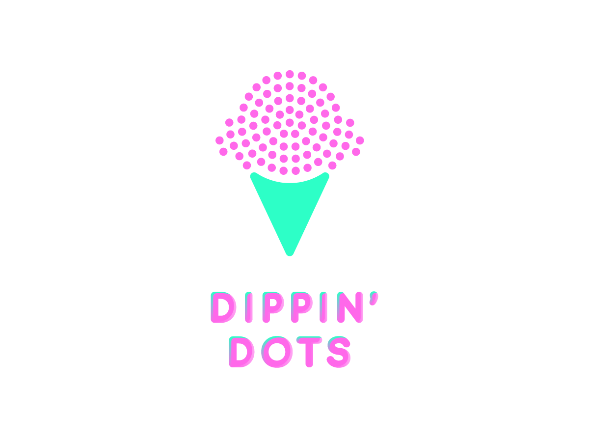
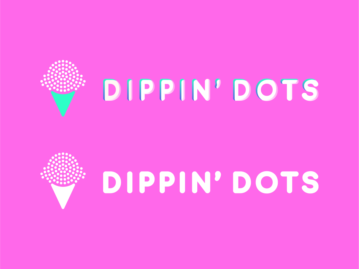
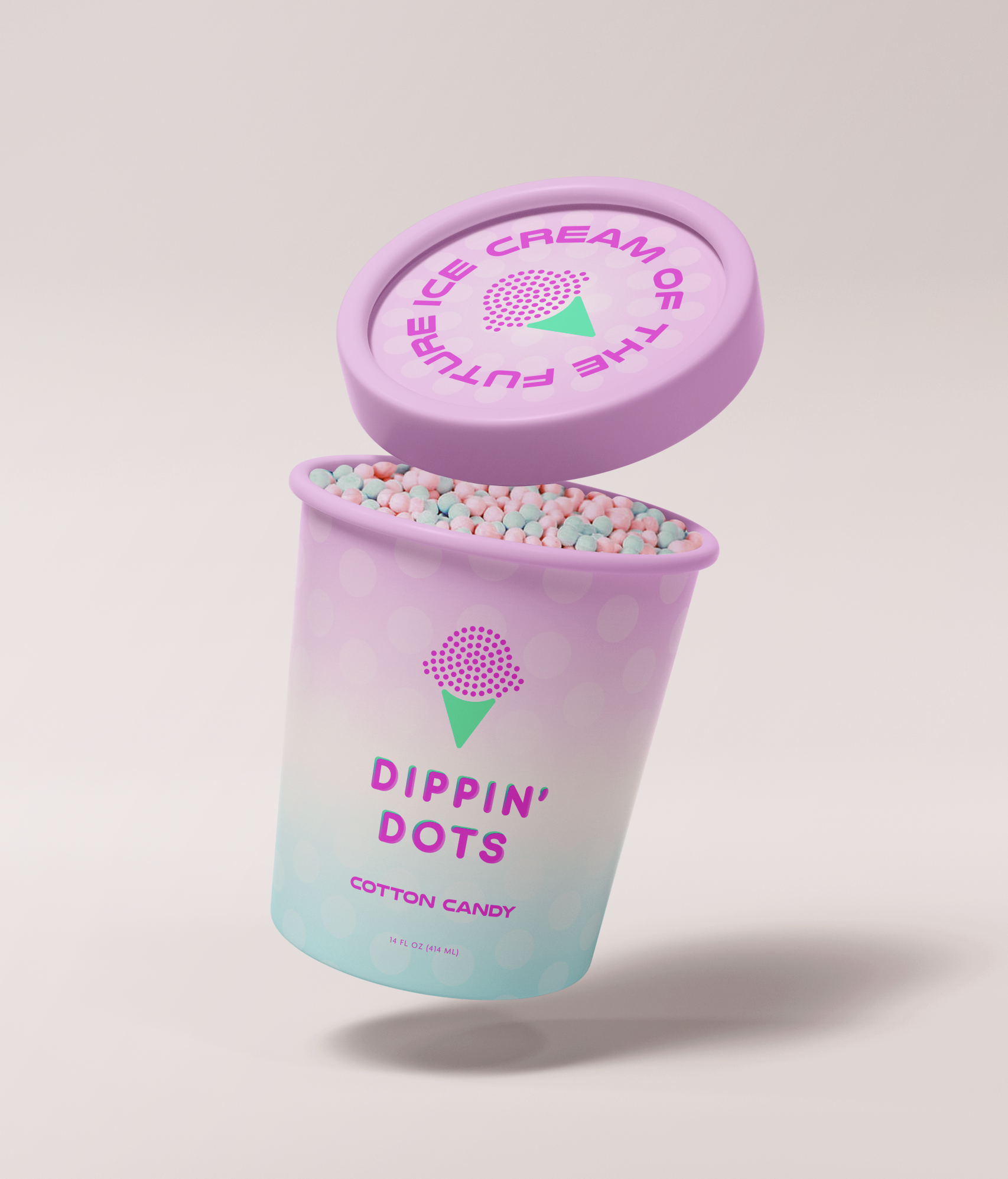
Dippin’ Dots has been an established brand for over 30 years, yet its visual identity has seen little evolution to reflect today’s modern, highly competitive marketplace. In an era where new, trend-forward ice cream brands emerge constantly, there is a growing need for legacy brands to remain visually relevant. As a personal project, I set out to reimagine Dippin’ Dots with the goal of revitalizing the brand and creating an identity that more strongly aligns with its iconic tagline, “Ice Cream of the Future.”
I selected a bold sans-serif typeface to convey a more contemporary, futuristic, and playful tone, while also incorporating a symbol inspired by the brand’s signature ice cream beads. Dippin’ Dots’ proprietary flash-freezing process using liquid nitrogen is a defining and highly distinctive aspect of the brand. By visually referencing this unique process within the logo, the design enhances instant recognition and reinforces the innovative spirit that sets Dippin’ Dots apart.